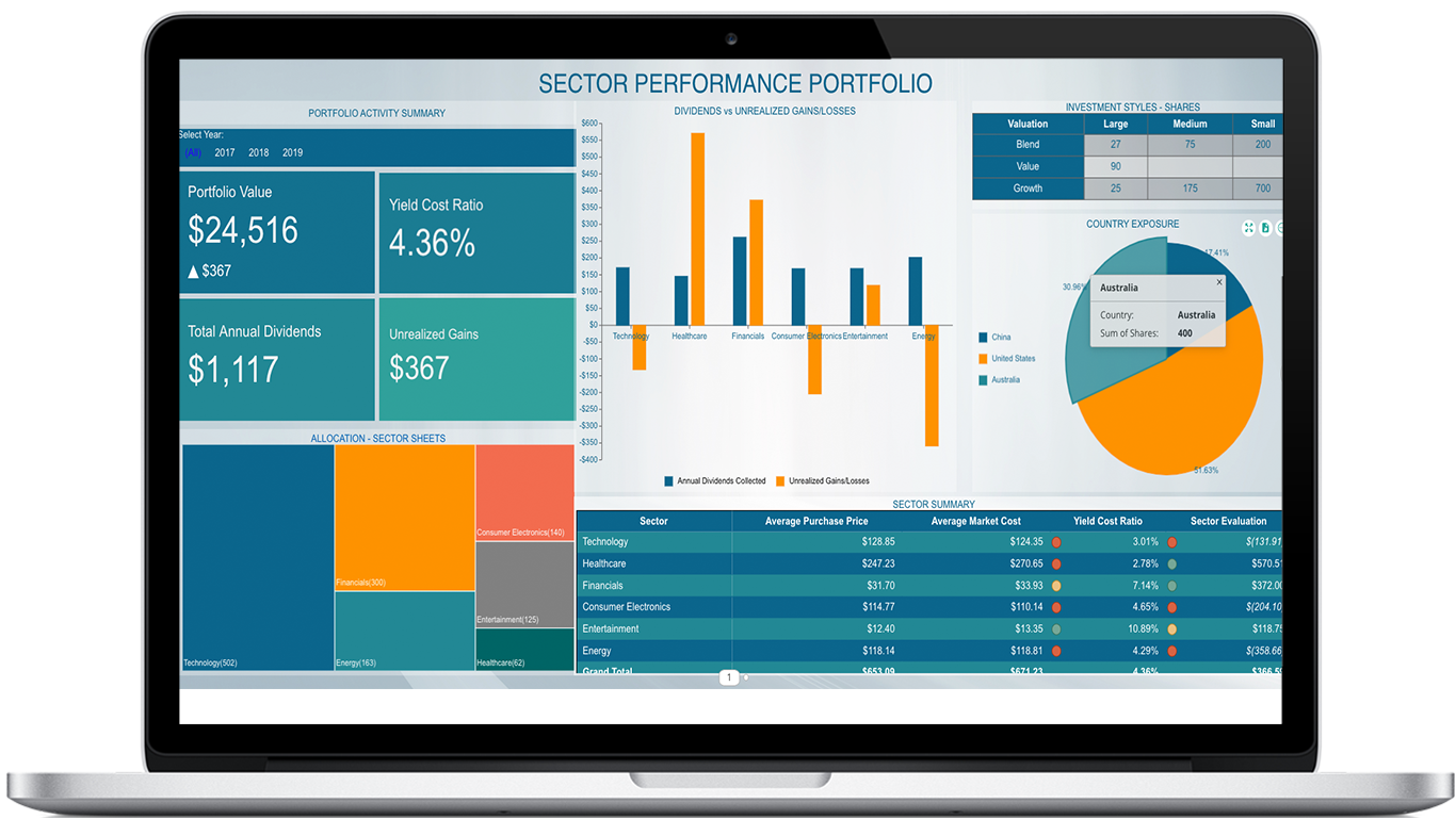
What is a custom visual:
They can have several different uses on a dashboard. Some can be interactive, while others are purely visual presentations of the data. It all comes down to what interaction features and settings are used for them.
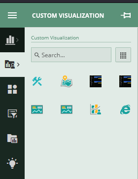
How do they work:
When you add a custom visual to Wyn they are brought in and have some standard setting that you are used to on all standard visuals. From there depending on the visual you will have visual specific settings to change how it works which are based off of it’s code. You also determine the data binding ability of the visual to the data that you can attach to it in Wyn as well. Users are able to use some of the normal scenario options, such as filters, etc. depending on what the visual is set up to allow.
The following is an example of the Line Racer visual’s settings and options.
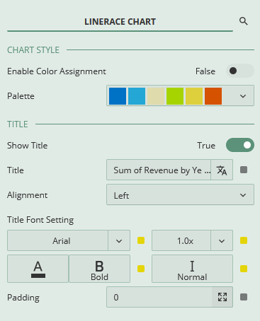
Inspector Tab
Chart Style is where you will work with the colors of the lines. You can assign different Palettes and enable color assignment inside of it.
Title will give you all the settings to control the title text on the visual. It is automatically filled in based off of the values you selected in the binding area, but it can be edited and even set up with localized content.
The Appearance section is where you have control of some of the standard visual settings that you can then apply to your visual. These are a constant of all Wyn visuals and can help with making scenarios stand out or fit in as much as needed.

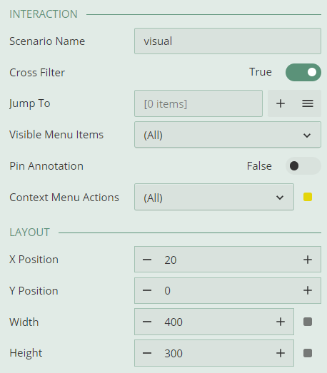
For the Interactions settings, this will help you determine some of the different states that users will have when clicking and interacting with the visual. You can enable jump-to's, as well as determine the visuals ability to interact with items around it with cross filtering
Then the Layout will determine the bounds and location of the visual, and can be edited with the mouse on the canvas or with the settings found here.
As you can see the settings from the visual are added to Wyn and are in the same familiar format for your ease of use.
Data Binding
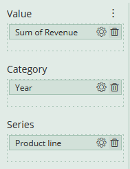
When in the Binding area a custom visual you will have multiple sections to work with. in general there are three main areas that will affect the visual. I am using the Line Racer which has these three directly, but there can be more or less depending on what is needed for your visual.
- Value - This is the area that you will determine the Y axis of the chart. You can work with the format when hitting the more options button, and you have the standard abilities of the settings gear from the standard Wyn visuals.
- Category - This will determine the X axis of the chart. The best uses of it are items like a year or other date/time data.
- Series - You will use this value to make separate lines on the visual. You can use this visual for different products or departments as a good way to compare them over time.
Tooltips and interactions
When interacting with dashboards you will often see the tool tip for a visual pop up. This can be used in a good few way with custom visuals since you have can design how they are used.
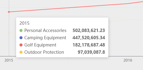
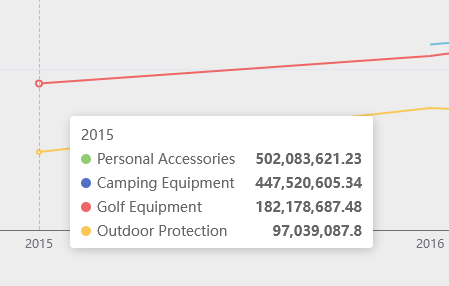
As an example of what you can do, the Line Racer give the user the ability to hover over a line and make the other lines fade as to see the current line easier.
Quick overview of Line Racer visual in action
The lines move towards the end of the x axis, while showing the change from point to point. Depending on the data bound to the visual, there can also be exits and entries of series to the race as well with each line having a color and title that it chases across the screen.
As seen in the images above there are a few different applications to this visual. It can be use on one or many lines to then show how they change when moving from category to category.


How are they created and added to Wyn:
In this section we are going to walk through the process of creating a custom visual and adding it to Wyn.
First you will need to download the tools package via npm. Then initiate the visual as seen below with you giving it a name before it makes the file network. You will want to set up a folder for these to be created in or else they will just be created openly in your user folder.

After executing the command above you will have a file from which the custom visualization will be created. Below is a section where we walk through the file structure.
File Structure:

visual.json:
This contains the meta-information for the visual. Below is what it will be generated with when creating a new visual.

assets:
This folder contains the icon and any images that are involved with the visual
capabilities.json:
Below is what will be initialized into your folder when creating a new visual. Bold items the base level of the file that can be included.

The dataBinding area has you declare the name and type of the incoming values from the data.
It can be followed up by the dataViewMappings, which can be used to set up minimum number of elements for the visual to work.
Conditions can be used for maximums as well as some other conditions.
Options controls all of the properties that you would find in the
Actions controls what options show up on the side of the visual.
Analysis controls the analysis panel.
Check out some of the other visuals capabilities.json on the other visuals on Github for more examples of what you can do.
package.json:
You will want to make sure to update the version number in this file each time you make a new version of a visual. This will help with updating your visual in wyn so that there is a clear older/newer visual to overwrite.
src and style:
This section is where you will have your source code for the visual. We suggest that you use ‘Typescript’ and ‘Less’. The workflow is already available with these so it is easier to build.
Check out some of the custom visuals src files on Github to help with this.
visual.d.ts, ts.config, node_modules, webpack.config.js:
These files contain data that helps the visual run inside of Wyn. No need to edit these as they are all included in the file when the project is created.
How to host your custom visual during creation:
After you create the file it is time for you to start up your visual with the visual tools.

You will need to make sure that you have developer mode on your server as true in the settings before you have a chance to start creating with the tools. You can find this in the admin portal following the directions as seen below.

After that you will have access to the Dev tool inside of your Wyn instance and be able to add it to a dashboard.

When you first drag it onto the dashboard you will see something like the image below.

When editing the files you are able to refresh the visual inside of Wyn using the refresh option. As you do this, any of the changed settings/data bindings will be updated as well as the visual itself when the visual is brought in from the latest saved files in the visuals folder.

Whenever you are finished with your editing you can use the following line to package up your visual into a .viz file.

Check out the in docs article on our Docs page to follow along through the process and check out our GitHub for some of the visuals we have made for your use, including the Line Racer chart.
Whenever you are ready to load them you simply need to drop/select the .viz file in the upload area on the create tab of the Resource Portal.


