Our post about how to supercharge your BI dashboards with data models shows the power of data models when extracting insightful information readily available from databases.
Quite often, the data required for visualization is readily available via the entities and attributes of a data model. For example, in a typical sales data model, you will get product details, unit sale details, sales demographics such as a sales channel, location, etc. These are sufficient to prepare any sales dashboard, such as product performance analysis.
However, several dashboard metrics may not readily be available from the data model, especially when looking at different and new ways to analyze information and find recent trends.
WynDashboards can now be generated from the data structures available from a data model by the end-user designing the dashboard themselves.
For example, information such as:
- Percentages and ratios like current ratio, turnover rate, operating margin
- Text manipulations like connecting product code and color to make up a single category for chart visualizations
- Conditional aggregation of data (like adding to the total sales only products based on color)
Traditionally, a business user cannot change the root structure of the data model due to ownership and data security rules. Editing the data model may impact other parts of the BI platform or not be in the realm of technical knowledge of the business users.
This is where a request would be made to the IT team/DBA for help. This need for a quick calculation to answer an ad hoc question calls for a further level of self-service capabilities allowing you to create a dashboard while working within the guide rails of the data model.
Introducing Analytical Expressions for BI Dashboards
The Wyn Enterprise 5.1 release introduces the Analytical Expressions to provide end-users with this self-service capability.
Here, we'll dive deeper into Wyn's Analytical Expressions. We'll use Analytical Expressions to solve a business problem with a retail data model.
Analytical Expressions in the Dashboard
An analytical expression is a formula that uses a set of built-in functions, operators, and constants that empowers end-users to define ad-hoc calculations to arrive at newly processed information.
Business users can use these expressions from simple summarization such as sum and count to complex decisions, like a percent of the total, conditional aggregations, etc.
WynDashboards allows you to use analytical expressions via two different objects: Measures and Calculated Columns.
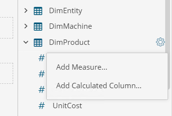
These can be added to an entity in the Data panel a shown below:

Choose to use "Add Measure..." when you need aggregations (for example, sum, average, ratios, etc.) and choose to use "Add Calculated Column.." when calculations are to be applied for the individual rows.
The Need for Analytical Expressions
In the earlier article, you have seen that the DBA created two attributes for the end-users - the cost of goods (COGS) and profit margin, in the data model based on the metrics a typical sales team would need for their dashboard needs.
Consider a situation where the DBA does not know in advance that you would need those metrics for your visualizations. In a traditional process, this may hold your dashboard until the DBA/IT admin handles your request by updating the model and publishing the new version for you.
The same situation from a self-service BI approach using Wyn's Analytic Expressions can cut this time down considerably.
Creating Analytical Expressions
The COGS measure used in the Data Table shows individual products' sale information from the earlier post.
The Profit Margin is used in the aggregated KPI Chart and the Data Table. With the model, as you design the dashboard and encounter the need for COGS and Profit Margin measures to answer your data questions, you can use the Analytical Expressions to add these calculations to the FactSales entity.
Add a Calculated Column for COGS, based on a simple expression multiplying SalesQuantity and UnitCost for every row as shown below:

Add a Measure for the aggregated Profit using built-in function CALCULATE() and SUMX() to work on aggregated data from the model as shown below:

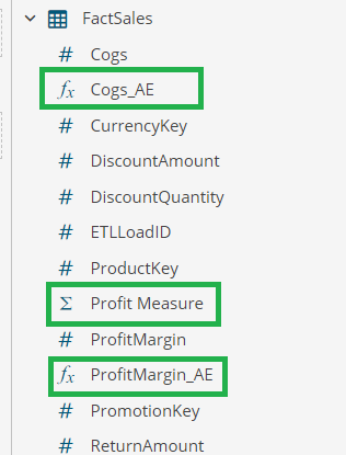
These objects appear in the data binding panel of a dashboard as shown below:

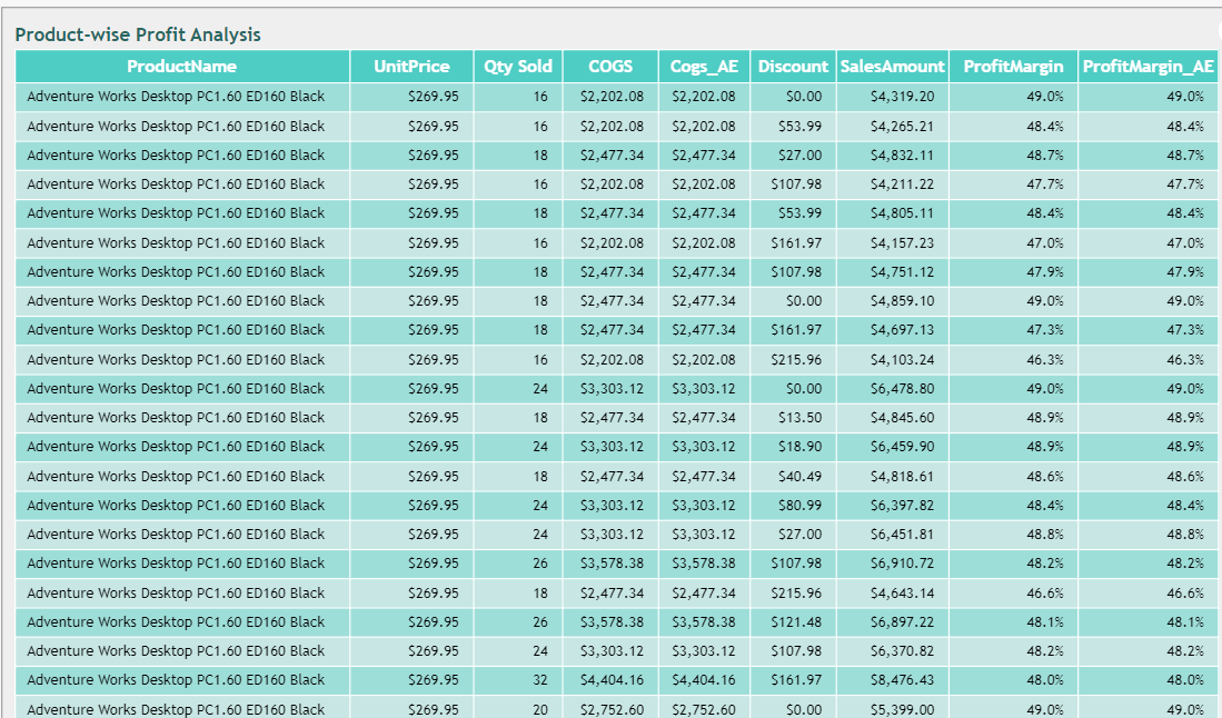
When the Calculated Columns and Measure are bound to the desired visualization in the dashboard, you will see the same result as when the custom attributes are added to the Data Model.
For example, see the Data Table below with the COGS and Profit Margin showing the same data for both Custom attribute and Analytical Expressions.

Save Time with Analytical Expressions for BI Dashboards
Wyn's Analytical Expressions save time; the dashboard designer no longer needs to process multiple requests to the DBA. This feature allows self-service independence for the dashboard end-user.
Business users can write expressions and use several built-in values and functions to perform more complex calculations and make data-driven decisions.
You can follow the Wyn Enterprise user guide to explore the various functions available for creating Analytical Expressions in a BI dashboard.


