Portfolio management is a complex and strategic financial function. It requires making information-driven decisions, matching investments with financial objectives, and reducing monetary risk by diversifying investments.
A portfolio analysis studies the investment portfolio to determine its appropriateness for an investor's needs, preferences, and resources.
Investors visualize data to:
- Determine financial objectives and investment durations
- Select investment options and build a diversified portfolio
- Monitor the performance of investments
Using Financial KPIs to Maximize Your Portfolio
A portfolio’s overall performance is impacted by a number of external factors. KPIs are a selection of the most important, quantifiable metrics used to measure key aspects of your portfolio. They allow you to track the value of various investments and observe how they respond to changes in volatile markets.
Embedded business intelligence tools allow investors and managers to customize dashboards with visualizations catered to the specific industry, fund type, or performance goals. BI dashboards allow investors to drill down metrics to better understand specific industry trends in different sectors over various periods of time.

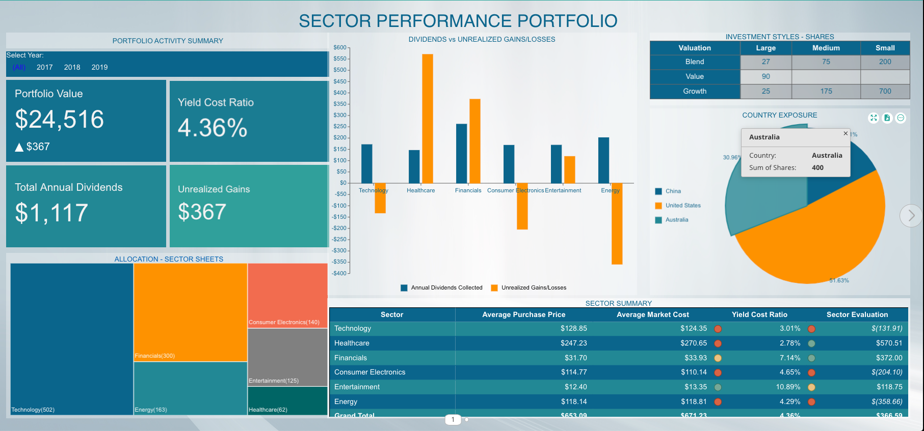
Stock Portfolio BI Dashboard
Data Visualizations for Portfolio Management
Here, we'll take a look at a portfolio management dashboard and offer tips on the best data visualizations to use for your portfolio management.
Line Charts
A line chart helps investors to spot the trends and/or highlight the price/stock movement. The X-axis, almost every time, represents the time period and the Y-axis represents the stock price.
As the line chart usually shows closing prices of the stock, the advantage of using them is that they help cut down the noise from data like open, high, and low prices.

Column Charts
A column chart is helpful in displaying the categorical data. A chart with varying column heights/widths helps in comparing two categories of the data. The chart also helps in spotting historical highs and lows and spotting a trend for different stocks or asset classes.
Pie/Donut Charts
The pie chart displays the relationship between a category of data. Pie charts can help show percentages and sizes of different categories, but they can be ambiguous when representing data when there are many categories and many varying data points. If there were more values to display, the pie chart could easily and logically be converted to a bar chart or treemap.

KPI/KPI Cards
The KPI cards are visualizations and expansions on the KPI Chart. With KPI Cards, users can display KPI’s with values and have the option to display a bar, line, or area chart in the card. This visualization enables users to display KPIs from separate quarters, years easily, or any measure they would like to display. KPI cards are helpful in providing indicators for a quick look into the performance of the portfolio before proceeding to the details.
Examples include allocation, yield cost ratio, annual dividends, and unrealized gains.
Data Table/Pivot
A table displays the performance of one’s portfolio, identifies the sector(s) that has a good or bad yield, without requiring in-depth comprehension.
Based on these numbers, the portfolio stakeholder(s) can do external research into the specific sectors to gain better insight to advise their investments.
Portfolio Value
The annual measure of returns on investments. The value displays the profits and losses yielded on the total stocks purchased. Portfolio value is determined by data pulled from several financial sources.
A line chart/column chart can show the portfolio value over a period of time.
Treemaps
A treemap can display the category/sector in which a user is holding stocks. A Treemap has the advantage of showing extensive aggregated hierarchical data in less space. A user can quickly spot the proportion/size of a data category using treemap.
The disadvantage of a treemap is that the user struggles to view a category as the data becomes closer to zero.
Dividends vs Unrealized Gains
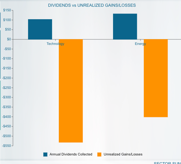
The bar chart displays the relationship between dividend yield and unrealized gains/losses.
An unrealized gain or loss shows when the value of the stock increases or decreases after being purchased, but before the investor sells the stock. In other words, it is a profit or loss that exists only on paper.
The most important items to look at in this particular chart are those which provide high dividends and low unrealized gains and vice versa. The portfolio manager then makes an informed decision to either sit on a pile of unrealized gains/losses or buy/sell the stock to help rebalance the number of shares with greater yield.

Allocation
Diversity is fundamental to a successful portfolio, and understanding how the pieces fit together is equally important. A treemap visualization shows clearly that this investor’s portfolio has the highest quantity of stock in the technology sector, the largest block. The data can be shown as a column or line chart as well. A stacked area chart can also be considered.
When these sectors are further broken out, it is possible to contextualize short-term fluctuations within historical trends. This helps investors implement and maintain a viable long-term plan.
Interactive dashboards let investors compare multiple data sets across sectors, countries, growth types, and risk types. Combining graphical representations of several data sets lets users simplify comparative analysis and find different patterns and predictive economic indicators.
Sector Summary Tables
The Sector Summary table presents figures for financial advisors and portfolio managers. The table provides high-level visual indicators that help investors identify sectors with good or bad yields.
Based on these numbers, the portfolio stakeholder(s) can do external research into specific sectors and gain better insight to advise their investments.
The data used in this table can be pulled into dynamic stock charts that provide users with information on any publicly-traded company within a specific sector.
The ability to examine individual companies for potential gains and losses allows investors a more granular view of their portfolios and may help them determine how to invest within various sectors.

Sector Summary Table
Country Exposure
This pie chart shows how investments are allocated across locations. Investors can monitor how much of their money is tied to a particular economy and adjust accordingly.
A pie chart is an ideal visual to be used when it comes to displaying categorical data where every single slice shows a specific category, but they can be ambiguous when representing many categories and numerous varying data points.
The pie chart makes sense to use for this specific visualization since there are only three values to display. If there were more values or zero values to display, this pie chart could easily and logically be converted to a bar chart or treemap.
Investors can monitor how much of their money is tied to a particular economy and adjust accordingly.
Dashboards also let users compare investment performance in established and emerging markets and use those numbers to inform their own geographical allocation. These features used in combination allow investors to prepare for changes in the global economy.

Investment Style
An investment-style box is a method that categorizes the stock on the basis of market capitalization and valuation. This chart helps the investor evaluate the diversification of a portfolio, and balance between the potential risk and return. For example, large-cap and blendstocks tend to be less volatile, and therefore less risky.
Conversely, small-cap and growth stocks carry greater risk as a result of higher volatility. The horizontal axis on this chart reflects the market cap. The vertical axis categorizes the stock by valuation.
Balancing risk types is an important subset of allocation. Visualizing this data alongside other diversification indicators allows users to better assess risk across different sectors.


