Organizational data often contains geographical/spatial elements such as countries, states, provinces, or continents. This is because the stakeholders, customers/clients, business users, operational sites/stores, assets, buildings, employees, and operational regions are physically located somewhere.
In BI Dashboards, a Map visual can be used to make an informed business decision using the data plotted against geographical locations. It helps to focus the reader’s attention on a specific region and see the data patterns easily and quickly.
Why Maps in BI Dashboard?
Maps can essentially be a powerful visualization tool in field service, construction, sales, engineering, and environmental services firms that collect large amounts of field data and need the exact location of data collection for operational efficiency and analysis.
Even though, the conventional BI tools - Charts, Tables, etc. can display the data for different regions. However, displaying a location as GPS coordinates (latitude/longitude) or region in a grid or bars makes it difficult for the audience to identify and coordinate the data patterns with the spatial details. Displaying the same coordinates on a Map can make it easy as shown in the image below:
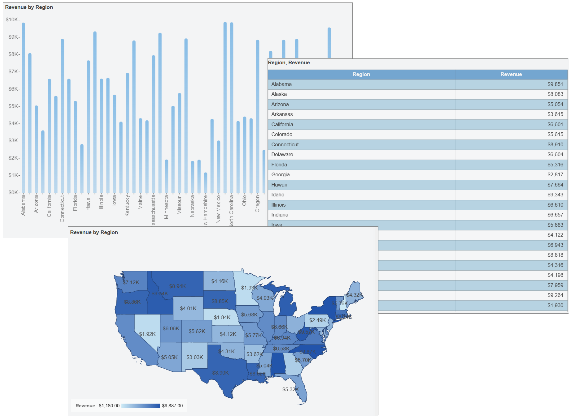
Using map visualizations analysts can stay focused on highlighting the key analysis points while locations/spatial details are handled by the map. Because maps are essential BI tools, WynDashboards offers several Map variations that business users can use to depict the relevant data and metrics along the spatial dimensions.
Maps in WynDashboards
The maps, usually drawn on a flat surface, demonstrate the size and shape of countries, the locations of landmarks, and the distances visualizing the globe on a screen. It symbolically depicts measures and metrics over geographically separated locations. WynDashboards offers interactive map visualizations to help you understand your geographic data in a better way. Maps in WynDashboards use OpenStreetMap as a base tile layer and on top of it use the GeoJson data stored within the Wyn Server to build well-informed visuals.
WynDashboards provides several map variations to support diverse location-based data analysis scenarios. These different types of maps cater to varying analysis needs, such as quantity, magnitude, trend, relationships, patterns, and much more, as described in this article.
Types of Maps in WynDashboards
WynDashboards offers the following 5 types of maps:
- Bubble Map
- Heat Map
- Flow Line Map
- Area Map
- (Basic) Map
Bubble Map
A Bubble Map uses the visual variable of size and/or color to display the difference in the magnitude of measures for different map points or regions. It displays one bubble per geographic coordinate or one bubble per region. This type of map can be used for metrics presenting a distinct figure for a specific region/geographical coordinate, for instance, sales for different regions, count of a dimension/entity, and so on.
The bubble map in WynDashboards, using both size and color variables, to present the cost spent on a marketing campaign and the number of successfully generated leads for different regions appear as shown in the image below.
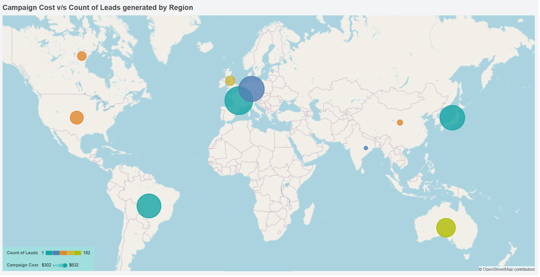
As you can see, the blue circles on the map for Germany and India clearly show that the number of leads generated is similar, but the larger size of the bubble for Germany indicates the cost of the campaign was a lot higher in that region.
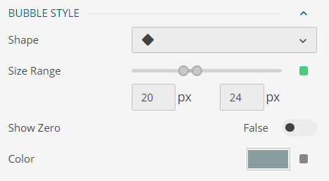
More often the bubbles are represented using circles, however, WynDashboards allows modifying bubble shape, along with color and size as shown below:
Heat Map
A Heat Map (or Geographical Heat Map) is a graphical representation of data on a map where values are depicted by colors demonstrating the areas of high and low density. It measures the density of data points within the radius of a certain geographic location.
This type of map is suitable for qualitative analysis and distributed data where darker or concentrated colors are associated with large counts, high probabilities, or frequent occurrences. For example, precipitation distribution, concentration of sales, count of regional stores, population density, and many others.
The heat map in WynDashboards depicting the brand awareness (w.r.t search volume) of a product among the users in different parts of the country is shown in the image below:
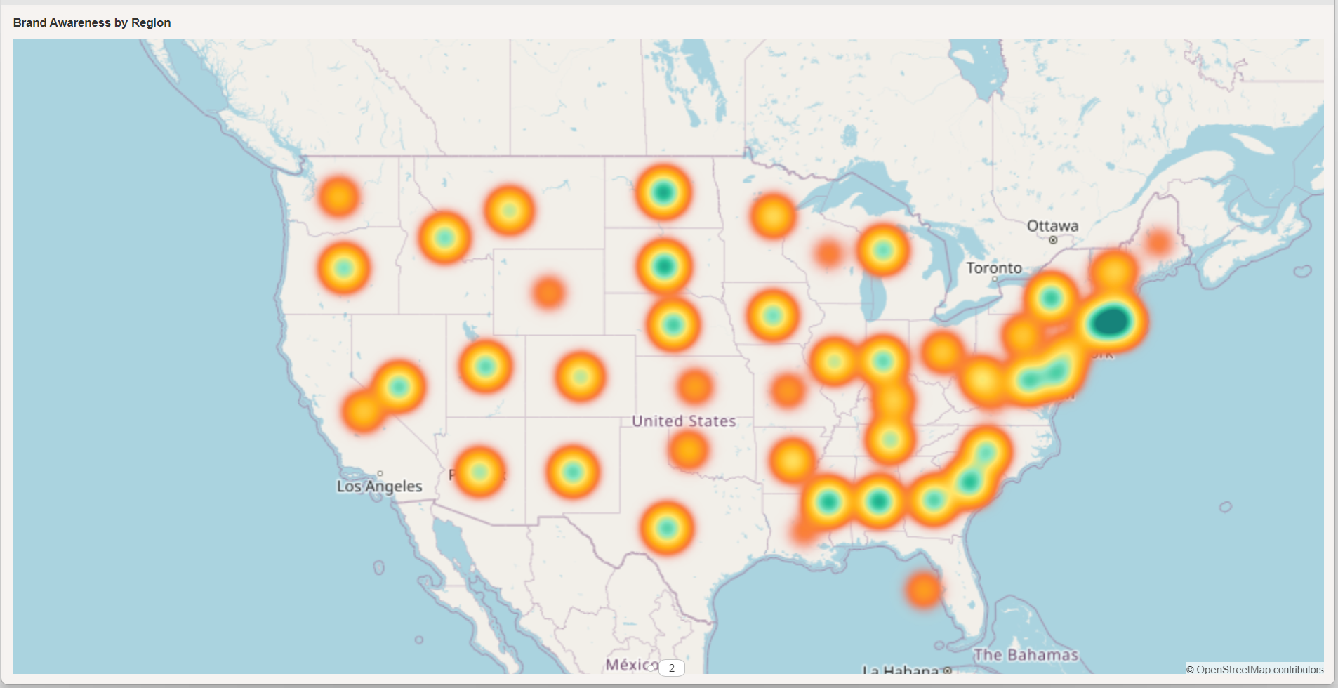
As you can see on the heat map, the search volume is highly concentrated in the Northeast US region.
WynDashboards allows configuring a heat map for the specific settings as shown below:

Flow Line Map
A Flow Line Map depicts the movement and magnitude of measures between two or more geographic locations. For instance, the export of commodities, item quantity dispatched from the manufacturing unit to selling outlets, the count of spatially located customers managed by a branch, the number of flights from an airport, and so on. It uses color and/or size to display the magnitude of the measure under analysis.
This map accepts two geographic locations/coordinates representing a source (from) point and a destination (to) point. A Flow Line map in WynDashboards, using the size variable, to depict the export of a commodity from stores located in the USA and Japan to other countries is shown in the image below:
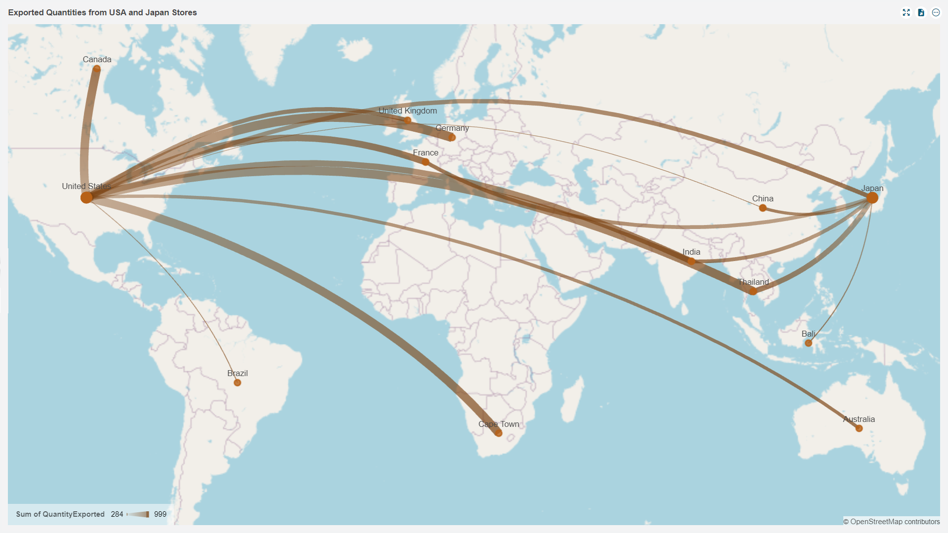
As you can see on the map, the thicker lines from the USA to Canada, Germany, Thailand, and Cape Town depict a higher export as compared to other regions.
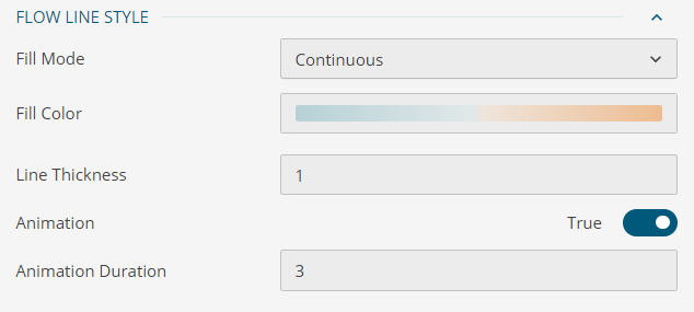
WynDashboards allows configuring a flow line map for the specific settings as shown below:
Area Map
Area Maps use colors to visualize a measure against the geographical regions. This type of map can be used to highlight significant areas or regions on the map. For example, regions with higher sales, regions with low impact of a disaster, with high availability of transport for a manufacturing unit, and many others.
An Area Map in WynDashboards depicting the revenue generated in different U.S. states is shown in the image below:
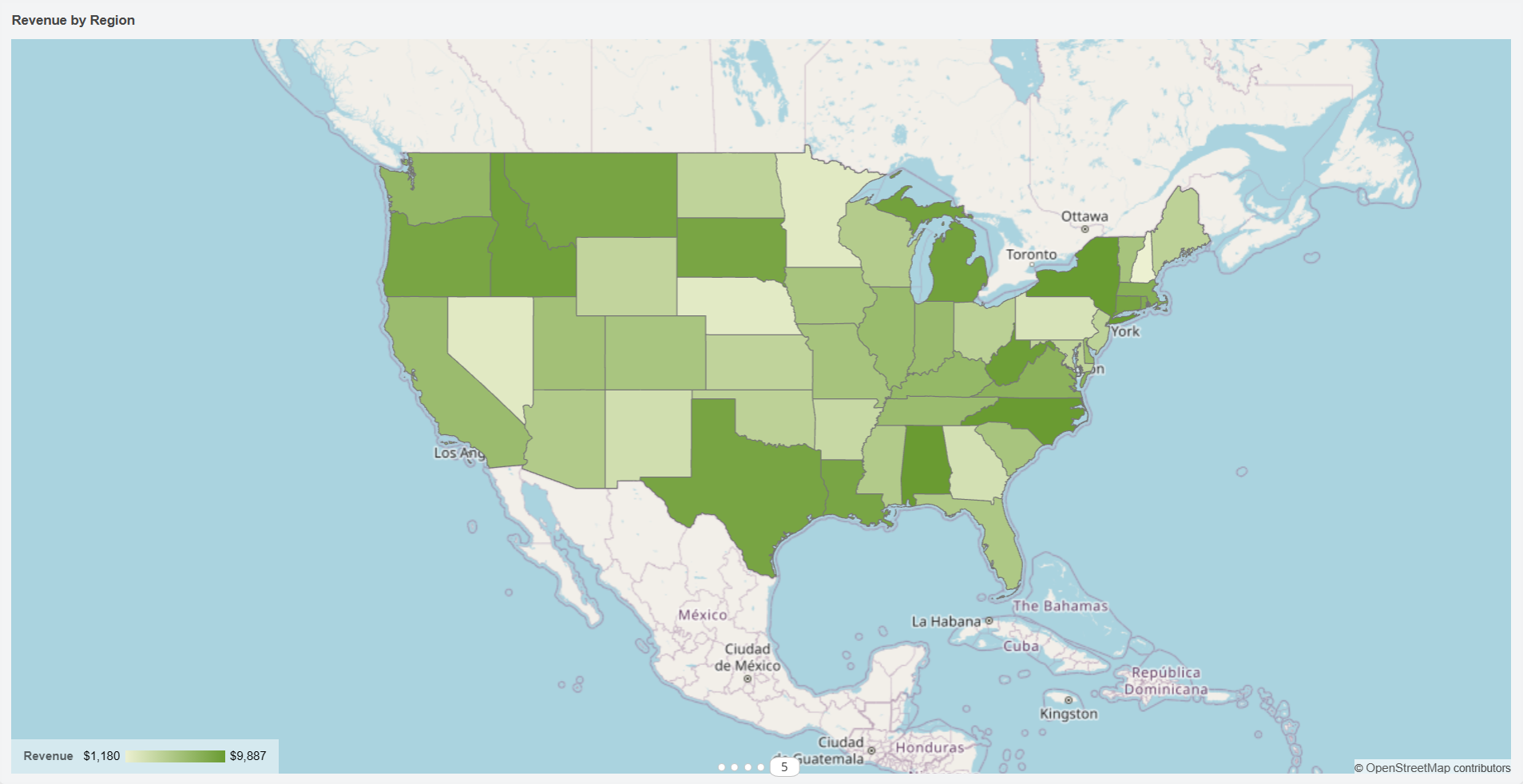
As you can see on the map, the regions with dark green color such as Montana, Idaho, Oregon, Texas, New York, etc. shows a higher revenue collection while the regions with lighter shade show moderate to low revenue collection.
WynDashboards allows configuring an area map for the specific settings as shown below:
Map (Basic)
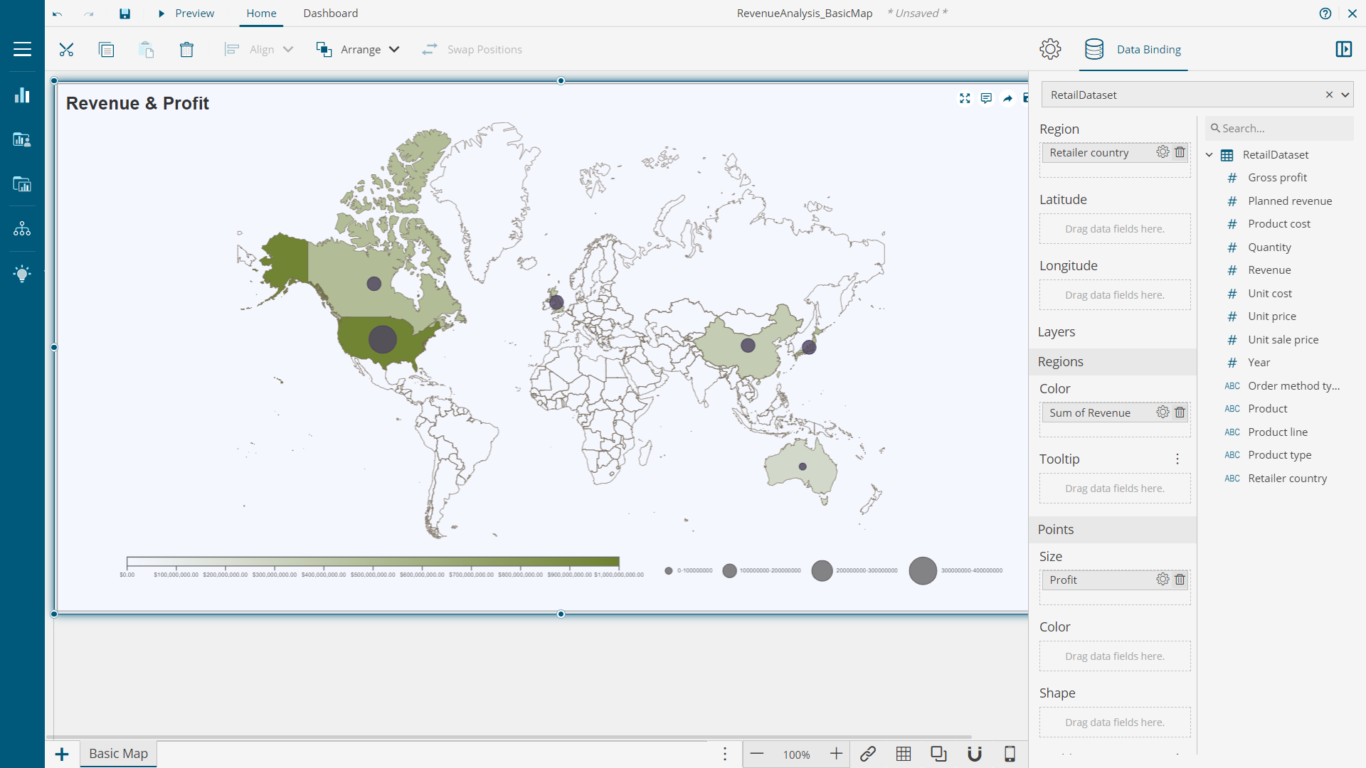
This type of Map visual helps to directly display GeoJSON map points on a flat surface in a dashboard and plot the metrics against them. The metrics and measures can be highlighted for regions and points using color, shape, and size. This type of map does not provide OpenStreetMap as a base tile layer.
A basic map in WynDashboards is adequate for a basic presentation with no strict or actual geographical markers. WynDashboards offers to configure this map for color, shape, and size.
As you can see in the image below, the darker color of Canada indicates high revenue when compared to China. However, the bubble size shows that the profit is nearly the same for the two countries.
Conclusion
The most effective dashboards are insight-driven and map scenarios are extremely helpful to build such dashboards against geographical business data. Thus, working with maps is an important skill to have.
Learn more about these map types in WynDashboards from the documentation.


