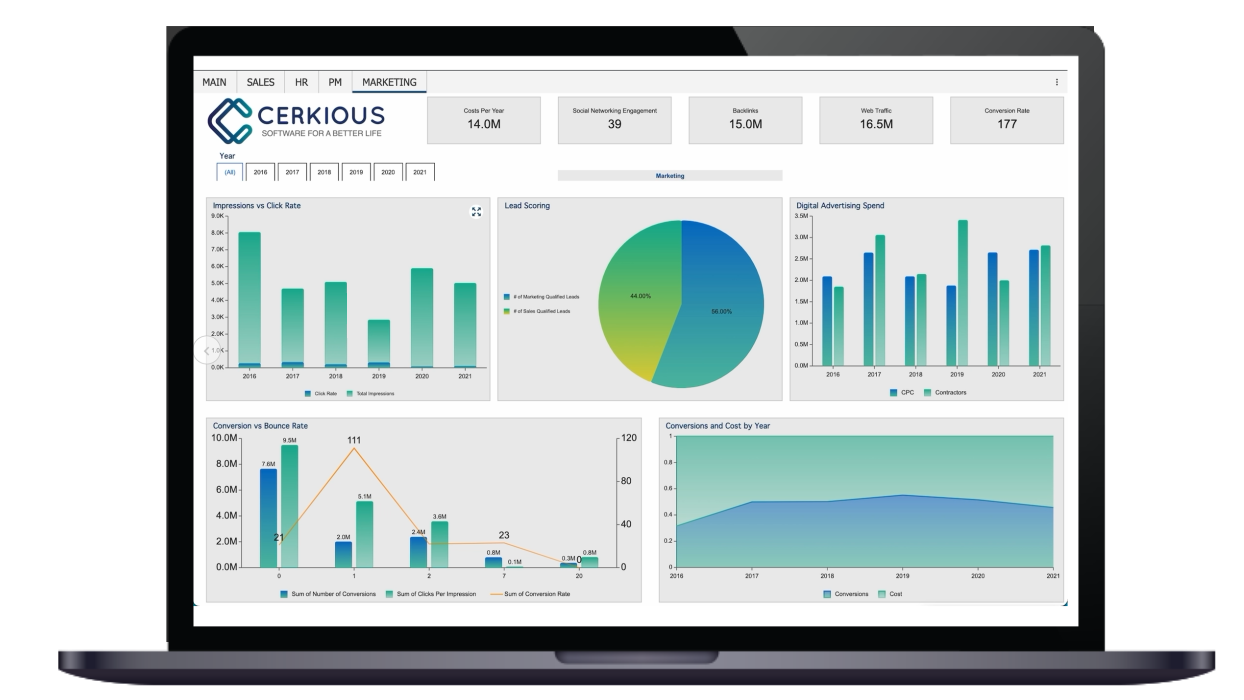
Ad hoc reporting is a business intelligence (BI) process where non-technical end-users can generate BI reports without the need from IT. Ad hoc reports can help readers visualize data, which is essential for obtaining actionable answers to their questions. These answers can help improve a business’s operational efficiency, increase profits, and expand the business over time.
Ad hoc reports provide several advantages over canned reports for both individual users and organizations. Each industry also realizes specific benefits from ad hoc reports (in addition to its general advantages). However, getting the most out of ad hoc reporting requires the designer to follow a number of best practices.
Ad Hoc Reporting Benefits
The exponential growth of data in today’s business world makes it essential to use ad hoc reports to segment large data sets, curate them, and analyze the results.
The biggest benefit of ad hoc reporting is that it provides non-technical personnel with the data they need to make daily decisions. These groups include executives, managers, marketing, sales team members, and many other groups in different industries, such as manufacturing, finance, retail, healthcare, manufacturing, insurance, and technology. Ad hoc reports also provide specific benefits for both end-users and enterprises.
Canned Reports vs. Ad Hoc Reports
The use of canned reports generally imposes a heavy burden on IT. A user must send a request to an IT member who is responsible for maintaining business intelligence (BI) tools. The IT member codifies the report, generates it, and sends the results to the requester. This process can take days, depending on the size of the organization and the specific process required.
This process is cumbersome for IT because it takes time away from implementing technological solutions for their organization, focusing on their focus. IT will typically automate much of this process for regular reports in large organizations, although one-time reports won’t benefit from this automation. Ad hoc reporting requires IT to set up the reporting tool, which only has to be done once.
Users are then free to create their own reports, which are often available within seconds. BI tools with ad hoc reporting capability are typically designed for non-technical users, eliminating the training that's normally needed for business users building ad hoc reports.

Ad Hoc Reports - Best Practices
1. Identify the question the report needs to answer
The process of designing an ad hoc report begins by asking the question you want the report to answer. It also includes the task of ensuring that the question hasn’t already been answered by an existing report. Even when an existing report already answers that question, it may be possible to improve the report by changing the layout.
In other cases, changes may only confuse readers without providing an added benefit. A report designer must consider both of these possibilities before modifying an existing report.
You should keep this practice in mind each time you design a report. Knowing why you need it and how the answer will drive your business is a key requirement for ad hoc reporting.
For example, you may want to know if the pricing of a particular product is competitive. Once you understand what you’re trying to learn, it becomes much easier to set the key performance indicators (KPIs) that will determine the relationship between price and sales for that product. Each ad hoc report you design should have at least one specific goal.
2. Keep reports visually simple
Determine the overall theme of the report, so you can design it without overloading the reader with too much information. This requirement means you should ensure that it makes sense for a single report to contain all the data elements you want to display. In cases where it doesn’t, you should break the data requirements into multiple reports.
Once you understand that the number of data elements in an ad hoc report should be minimized, the next task is to decide which ones it must have. This task requires you to consider your audience, including their function and level of subject knowledge.
For example, a sales manager might want to know which of his team members is selling the most products, while a marketing manager would be more interested in knowing which piece of content is capturing the most leads. Only when you know what your audience wants will you be able to design a report that provides benefits for them.
Ensure that you indicate whether a KPI is good or bad in some way. One common practice is to compare actual values to the expected values, such as revenue for a particular time-period. You should also use metrics with which your audience is familiar when deciding how to display data on a report.
Furthermore, ad hoc reports should almost include a date range, even if it isn’t in the body of the report. Keeping reports simple requires you to ensure that it doesn’t contain unnecessary data points.
3. Consider the report layout
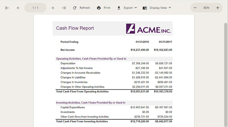
Minor features in a report’s layout can make a big difference in the value it provides for the reader. Sort order, grouping scheme, and filtering criteria are all important considerations in report design because they reduce the amount of data the viewer must process.
The layout is especially important for preventing managers from becoming overwhelmed because it can lead to decision fatigue. One good way to do this is to limit the number of KPIs in a single report to six. You can still display more than six data elements in total, but you need to establish a hierarchy of their visual importance when selecting your layout. KPIs should occupy the most important positions in the layout, with other elements occupying second and tertiary positions.
Modern reporting software allows you to design your own dashboards, which should become valuable assets for designing the layouts of online reports.
4. Make aggregated data points easily accessible
Aggregate data points like total sales in a quarter should be easily accessible throughout the report. Avoid placing them at the bottom of a table or on the last page of the report, unless it’s a short report of no more than two pages. Emphasizing aggregate data for managers in this way increases their efficiency because they don’t have to search for the information of the greatest interest to them.
One strategy for calling attention to aggregate data is to display it separately from the body of the report such as an executive or section summary. These summaries typically appear at the beginning of a report, which is a better location for aggregate data than the bottom. Users should also be able to access details on aggregate data directly from the summary. In this case, you should place these details on the same page or peer page instead of a lower page in the reporting hierarchy.
Additional methods of making aggregate data accessible include the use of inline highlighting for this information, especially for large tables. This technique typically involves the use of bold font and different colors, although this may not work well with some fonts or readers with deficient color vision. Graphical displays of information in the left margin can also help readers locate aggregate data more easily.
5. Maintain report design consistency
Effective data visualization requires the report to have a consistent appearance for all pages. This requirement applies to all of a report’s visual elements, including colors, fonts, theme, and layout. These elements also need to be balanced on each page to make the information more easily digestible.
It’s vital to consider how well displays such as charts and graphs work together to present essential information while minimizing the time that the reader needs to spend understanding it.
A chart should use the same color scheme as the metrics it represents, allowing the reader to associate the chart with the metrics more easily. For example, a sales analysis typically includes information on both sales and returns. The sales information in that report could always be shown in yellow-green, while the return information is always shown in blue. This consistency of color would help the user quickly visualize the metrics in the report.
6. Using reporting templates
A report template is highly helpful for keeping visual elements such as charts and graphs consistent, even when a non-technical user is designing it. A template can ensure the reports use the same colors for accents and highlights. You should also use a template to ensure a line chart is always used to represent a data set with an obvious trend.
Ad hoc reports provide end-users with the ability to create their own reports at any time. To simplify the report design time, business intelligence software tools offer end-users the ability to easily create ad hoc reporting templates. Using pre-made templates, end-users can build, format, and export ad hoc reports on their own (without assistance from IT).
This capability allows anyone (technical and non-technical end-users alike) to present information to another party for analysis or discover their insights into the data, without the need to rely on someone else to generate the report.
The flexibility of ad hoc reporting offers users more ways to interact with their data since they can edit and reuse the report for a different purpose. Ad hoc reports also allow users to test their ideas while adhering to best practices in reporting design. These practices help readers to visualize data and obtain meaningful insights from their reports.


